Color Symbolism Differences Between Chinese and Western Cultures
Color symbolism creates a vibrant language that speaks volumes without a single word, yet its meanings shift dramatically across cultures. Understanding the differences in how colors are perceived in Chinese versus Western contexts is crucial for effective design, marketing, and communication. This guide dives deep into the specific meanings, historical roots, and practical implications of these cultural color codes, helping you avoid missteps and connect more meaningfully with a global audience.
Simply put, in Western cultures, colors like red and green are primarily associated with universal concepts like stop/go or love/environment, while in Chinese culture, the same colors are deeply intertwined with luck, prosperity, and nature. A single color can carry completely opposite connotations, such as white representing purity in the West but mourning in China.
Key Takeaways
- Color symbolism in Chinese culture is often tied to philosophy (like yin-yang), historical symbolism, and phonetic puns, while Western meanings are more influenced by nature, religion, and psychology.
- Red is the most critical color to understand: in China, it symbolizes luck, joy, and prosperity, whereas in the West, it often signifies passion, danger, or love.
- White is a high-contrast color between the cultures: it represents purity and weddings in the West but is the color of mourning and funerals in China.
- Yellow in China historically represented imperial power and royalty, but in many Western contexts, it can signal cowardice or caution.
- Modern globalization is creating some overlap, but traditional color meanings remain deeply significant for respectful and effective cross-cultural engagement.
What Is Color Symbolism and Why Does It Matter?
Color symbolism refers to the associations, meanings, and emotions that colors evoke within a specific cultural context. It’s a non-verbal language where hues carry preloaded messages about values, beliefs, and social norms. These meanings are not universal; they are learned and embedded over centuries of tradition, religion, and social practice.
Getting these meanings wrong can lead to significant misunderstandings. For a business launching a product in China, using black and white packaging that feels sleek and modern in Europe might be interpreted as a funeral product. For a designer creating a global brand, assuming that green only means “eco-friendly” ignores its strong association with infidelity in China.
The importance lies in three key areas:
- Marketing and Branding: Color choices directly impact brand perception and consumer behavior. A red sale sign means “clearance” in the U.S., but a red envelope means “monetary gift” in China.
- Design and User Interface: Websites, apps, and products must use colors that align with user expectations. Using red for an error message in a Chinese app might not be as intuitive.
- Cross-Cultural Communication: From diplomatic gifts to wedding planning, color choices signal respect and understanding (or a lack thereof).
How Does History Shape Chinese Color Meanings?
The roots of Chinese color symbolism are deeply embedded in over 5,000 years of history, philosophy, and imperial decree. The Five Elements theory (Wu Xing) – wood, fire, earth, metal, and water – is a primary framework that assigns specific colors, seasons, and virtues to create a harmonious system. This cosmological connection gives colors a weight beyond mere aesthetics.
Imperial regulation also played a massive role. Certain colors were restricted to the royal family, cementing their association with power and prestige. The use of color was a codified part of social hierarchy and ritual, much of which still influences modern perceptions.
| Color | Primary Chinese Symbolism | Historical/Philosophical Root |
|---|---|---|
| Red | Good fortune, joy, prosperity, celebration | Associated with fire and the south in Wu Xing. Believed to ward off evil spirits. |
| Yellow | Imperial power, royalty, sacred | The color of the Emperor during imperial dynasties. Associated with earth and the center. |
| White | Mourning, death, funerals, the afterlife | Associated with metal and the west in Wu Xing. The color of burial shrouds. |
| Black | Water, heaven, winter, seriousness | Linked to water in Wu Xing. Used in formal and official contexts. |
| Blue/Green | Health, prosperity, harmony, but also infidelity | Green is linked to wood and growth. The term “wearing a green hat” means one’s partner is unfaithful. |
This table illustrates how each color is not just a hue but a carrier of philosophical and historical meaning, directly impacting its use in modern life.
Why Do Western Color Meanings Evolve Differently?
Western color meanings are less governed by a single cosmological system and more shaped by a confluence of Greco-Roman mythology, Christian iconography, national flags, and psychological studies. Nature is a primary driver: green for forests and life, blue for sky and sea. Christian symbolism assigned colors like purple to royalty and penance (Advent/Lent) and red to the blood of Christ or the fires of hell.
The Enlightenment and the rise of science brought a shift toward understanding color through physics and psychology. The study of color theory and its impact on mood and behavior (e.g., warm colors stimulate, cool colors calm) further layered meaning. This leads to more fluid and often conflicting interpretations.
For instance, pink is widely associated with femininity in the West today, but this is a relatively modern convention from the mid-20th century. Before that, pink was considered a diminutive of red and was often used for boys, while blue, associated with the Virgin Mary, was for girls. This demonstrates how Western color symbolism can be more malleable and fashion-driven.
Tip: When researching Western color meanings, check the specific context. “Blue” in a corporate setting implies trust and reliability, while “feeling blue” means sadness. The same color carries multiple layers.
What Are the Biggest Contrasts in Specific Color Meanings?
Several key colors sit at the intersection of cultural divergence, where their meanings are not just different but can be direct opposites. Understanding these specific contrasts is fundamental to avoiding major faux pas in global interactions.
Red: Celebration vs. Danger
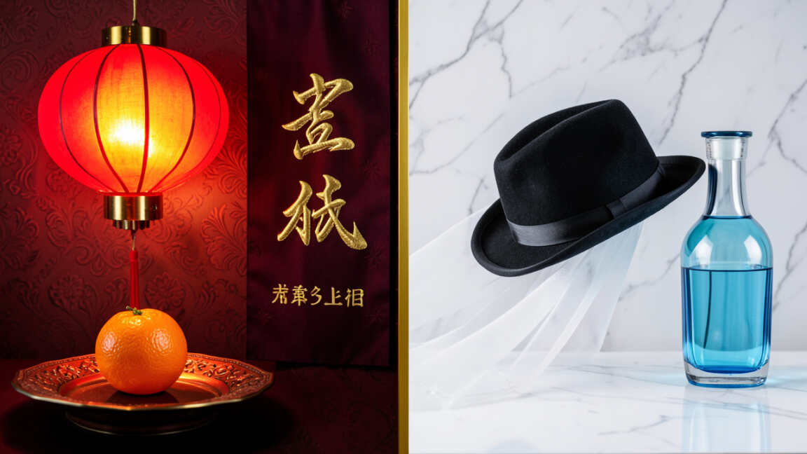
In China, red is the color of life itself. It dominates weddings (the bride’s dress, invitations, decor), Lunar New Year (envelopes, couplets, lanterns), and all festive occasions. It is believed to bring luck and scare away evil.
In contrast, Western red is a color of duality: it signals love and passion (Valentine’s hearts) but also danger (stop signs, warning labels), anger, and financial loss (“in the red”). Using red for a “clearance sale” banner in China would be fine, but a red “exit” sign might carry unintended negative connotations.
White: Purity vs. Mourning
This is perhaps the most critical contrast. In Western cultures, white is the color of weddings, purity, innocence, and new beginnings. A white dress is the ultimate bridal symbol.
In China, white is the color of death and mourning. Wearing white to a Chinese wedding would be a grave insult. Instead, guests wear bright colors, and the bride wears red.
Funerals involve white clothing and white wreaths.
Yellow: Royalty vs. Caution
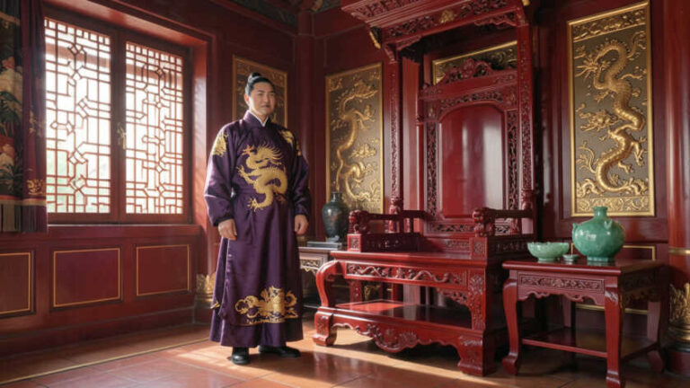
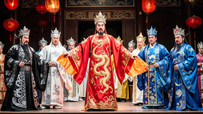
In China, yellow was the exclusive color of the Emperor for centuries. It represents power, royalty, and the earth element. It remains a prestigious and positive color.
In the West, yellow has mixed meanings. While it can represent sunshine and happiness, it is also strongly associated with cowardice (“yellow-bellied”), caution (warning signs), and sometimes deceit or jealousy. A yellow gift box might feel cheerful in the West but overly imperial or even cheap in a Chinese context if not executed carefully.
| Color | Common Chinese Meaning | Common Western Meaning | Potential Conflict Area |
|---|---|---|---|
| Red | Luck, prosperity, joy | Passion, danger, love | Marketing campaigns, product packaging |
| White | Mourning, death | Purity, weddings | Event planning, gift wrapping, bridal wear |
| Yellow | Imperial power, earth | Caution, cowardice | Brand logos, warning signage, children’s products |
| Green | Health, harmony, but also infidelity | Nature, environment, go, money | Fashion, hats, financial products |
| Purple | Romance, divinity, wealth | Royalty, luxury, sometimes spirituality | One of the few colors with broadly positive cross-cultural alignment. |
This comparison table highlights how even colors with some overlapping positive traits (like purple) have different specific connotations. The differences in green are particularly nuanced and important for product branding.
How Does Language Reinforce Color Symbolism?
Language and idiom are powerful forces that solidify and transmit color symbolism. In Chinese, many phrases use colors to convey specific meanings, often based on homophones (words that sound alike). The classic example is the phrase “to wear a green hat” (戴绿帽子, dài lǜ màozi), which unequivocally means a person’s spouse is cheating on them.
This makes green a highly problematic color for gifts, especially hats, for Chinese partners.
Other Chinese idioms include:
- Red (红, hóng): “Red double happiness” (囍) is a staple at weddings. “Red and white events” (红白喜事) refers to weddings and funerals.
- White (白, bái): “White job” (白事) means a funeral. “Pay in vain” (白费, báifèi) uses the character for white.
- Black (黑, hēi): “Black market” (黑市) and “black list” (黑名单) are used directly, carrying negative connotations similar to English.
In English, idioms are equally revealing: “seeing red” means angry, “feeling blue” means sad, “green with envy,” “black sheep of the family,” and “white lie.” While some, like “black sheep,” have parallels, the unique cultural weight of the Chinese phrases (especially green hat) has no Western equivalent.
What Are the Practical Applications for Global Design?
Applying cross-cultural color knowledge is essential for design, marketing, and product development. The key principle is audience segmentation and testing. A design that works in one market may fail or offend in another.
Here are actionable steps for designers and marketers:
- Audience Research: Before finalizing a color palette, confirm your primary audience. A product targeting Chinese millennials will have different color considerations than one targeting European baby boomers.
- Contextual Testing: Use A/B testing with focus groups from your target culture. Present different color options and gather feedback on the emotional and cultural associations they evoke.
- Adapt, Don’t Assume: Be prepared to create localized versions of designs. McDonald’s, for example, adapts its color scheme and menu colors in different regions to align with local preferences and symbolism.
- Leverage Neutral Colors: When in doubt, especially for a truly global brand, neutrals like blue (generally positive in both cultures for trust), grey, and metallics can be safer, though not always as impactful.
Warning: Never rely on a single translation or a quick Google search. Color meanings are layered. A “green” initiative in China might need to be framed carefully to avoid the infidelity association, perhaps by emphasizing “growth” or “vitality” over the color green itself in messaging.
Why Is Yellow Considered So Complex?
Yellow is a fascinating case study in cultural complexity. Its high status in China as the imperial color cannot be overstated. For over a millennium, commoners were forbidden from wearing yellow.
It remains a color of prestige, used for important packaging and during festivals like the Mid-Autumn Festival.
In the West, yellow’s complexity arises from its dual personality. Its positive side is sunny, optimistic, and energetic. Yet its negative side includes associations with sickness (jaundice), cowardice, and hazard.
This makes it a high-risk, high-reward color in design. A bold yellow can grab attention and convey happiness, but in a different context, it can feel anxious or cheap. Its use in branding (like IKEA or National Geographic) leverages the positive, energetic side.
Who Needs to Understand These Color Differences?
The audience for this knowledge is vast and crosses multiple professional fields. Anyone involved in creating, marketing, or delivering products or experiences to a Chinese or Western audience benefits from this understanding.
- Graphic and UX/UI Designers: Must create interfaces, logos, and visuals that are intuitive and non-offensive.
- Marketing and Advertising Professionals: Campaigns live or die by cultural resonance. Color is a primary tool for emotional connection.
- E-commerce Managers: Product photography, website design, and packaging colors influence buying decisions and brand trust.
- Event Planners and Hospitality Workers: From corporate galas to weddings, decor sets the tone. A red-themed Chinese New Year party is festive; a white-themed one is a disaster.
- Exporters and Importers: Packaging and product design must meet cultural expectations to sell successfully.
- Diplomats and International Relations Officers: Protocol often involves color symbolism, from gift-wrapping to official ceremonies.
Frequently Asked Questions
What is the most important color difference between Chinese and Western cultures?
The most critical difference is likely the meaning of white. In Western cultures, it symbolizes purity and weddings, while in Chinese culture, it is the color of mourning and funerals. Misusing white in a Chinese celebratory context can be deeply offensive.
Can I use red for a brand targeting both Chinese and Western audiences?
Yes, but with nuance. Red is positively viewed in both cultures, but the specific connotations differ. In China, it screams luck and celebration.
In the West, it can mean love, passion, or danger. For a global brand, red is a strong, energetic choice, but its application should be tested in both markets to ensure it aligns with the intended message.
Why is green problematic in China?
Green has a negative association in China because of the idiom “wearing a green hat,” which means one’s partner is unfaithful. Therefore, giving a green hat as a gift is a major taboo. While green as a color for nature or health is becoming more accepted, this deep-seated cultural meaning still makes it a color to use with caution in certain contexts.
Are there any colors that are universally positive?
No color is entirely universal, but some have more consistent positive associations. Blue is often seen as trustworthy and calm in both cultures (think corporate logos). Purple also carries connotations of royalty, luxury, and quality across many societies.
However, even these can have minor variations and should always be considered within the full cultural context.
How is this changing with globalization?
Globalization creates a hybrid awareness. Younger, urban populations in China are increasingly exposed to Western color symbolism through media and brands. However, traditional meanings remain powerful, especially for formal occasions, older generations, and in marketing that aims for deep cultural connection.
The safest approach is to respect traditional symbolism while acknowledging evolving modern interpretations.
Final Thoughts
Navigating the worlds of Chinese and Western color symbolism is about moving beyond the surface of aesthetics to understand deep-seated cultural narratives. The differences between red as celebration versus danger, white as purity versus mourning, and green as growth versus infidelity are not trivial details but foundational aspects of communication. By investing time in understanding these nuances, you ensure your designs, brands, and actions resonate correctly, fostering respect and genuine connection across cultures.
Always research, always test, and when in doubt, consider the deeper story your colors are telling.